poster revisions
contrary to the angle i took for the intro
i went for a punkish look for the posters
(more explained below).
i'm making a series ...
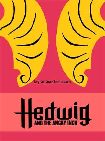
C L I C K on this first pink one for a full-res image.
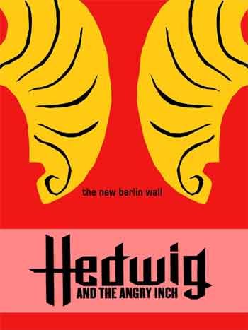
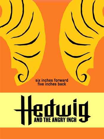
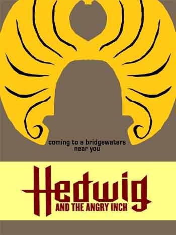
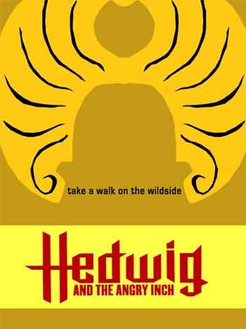
i like the bright colors (rather than the muddy earthy tones) best.
but its me playing (struggling) with the concepts of
gram rock / punk vs. the midwest !!
i went for a punkish look for the posters
(more explained below).
i'm making a series ...

C L I C K on this first pink one for a full-res image.


i like the bright colors (rather than the muddy earthy tones) best.
but its me playing (struggling) with the concepts of
gram rock / punk vs. the midwest !!


0 Comments:
Post a Comment
<< Home