Friday, April 28, 2006

REVISED TITLES

i had to revise the titles to make them title safe.....
whoops.
consequently the majority of the titles look differet.
the pacing at the end is also altered a bit--
i think it is (still) rushed, but the song can't end in the middle of a word/verse !!

additionally, i scrapped my "lou reed" is playing on the radio concept for the sound. despite working on the sound design, no matter what i did sounded horrible: as if the song was playing while i was filming and i did not know how to get rid of it.

C L I C K
for another super compressed (yet revised) version :

Thursday, April 27, 2006

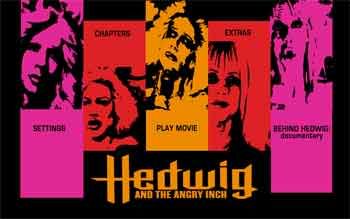
dvd menu jpeg

kind of like my poster concept,
the dvd menu design is inspired by more glammish / punkish themes,
contrary to the path i took with the title sequence.


C L I C K
for a bigger / better resolution image ...

Wednesday, April 26, 2006

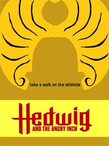
poster revisions

contrary to the angle i took for the intro
i went for a punkish look for the posters
(more explained below).

i'm making a series ...


C L I C K on this first pink one for a full-res image.


i like the bright colors (rather than the muddy earthy tones) best.
but its me playing (struggling) with the concepts of
gram rock / punk vs. the midwest !!

YOU TEASER

here's the revised teaser trailer.
i tried to put audio on the end as suggested,
but could not find anything that could be used and would still flow well.
when she says "its what i've got to work with",
she is basically whispering with a bit of static noise,
and therefore sounded off when i edited it in.

nevertheless i edited the ending to make it try to flow a bit better.


C L I C K on the image to see.

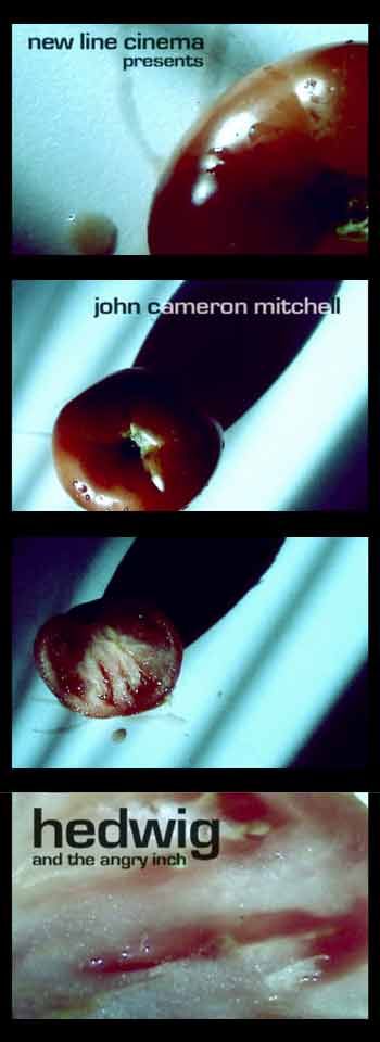
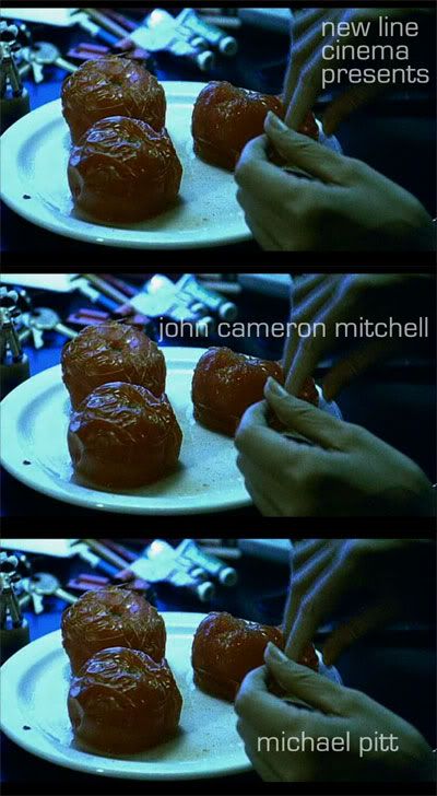
you say tomato ..........

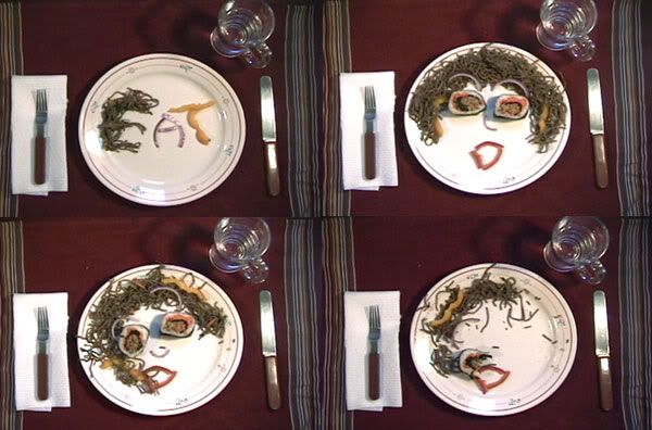
so here is my second "draft" of the titles.
much closer to what i believe will be the final piece.
and a SIGNIFICANT improvement to the first rough cut (yikes !)

i feel that conceptually, it works. aesthetically (for the most part), it works.
but as a whole, well, not quite.
but i am glad i have explored concepts outside the realm of the expected,
while still maintaining a simple aesthetic (as was my goal).


C L I C K
on the image for a very compressed version
courtesy of photobucket

Sunday, April 23, 2006

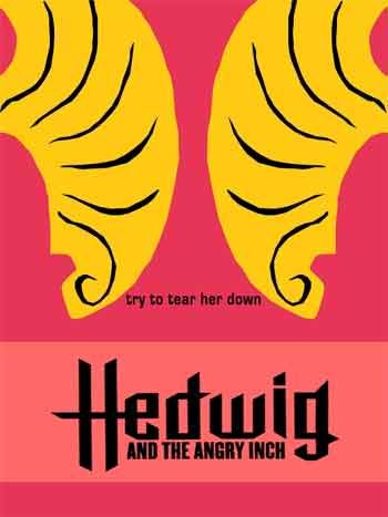
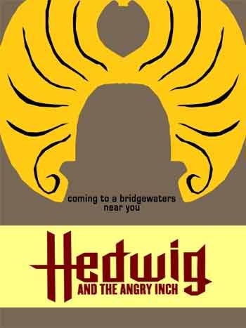
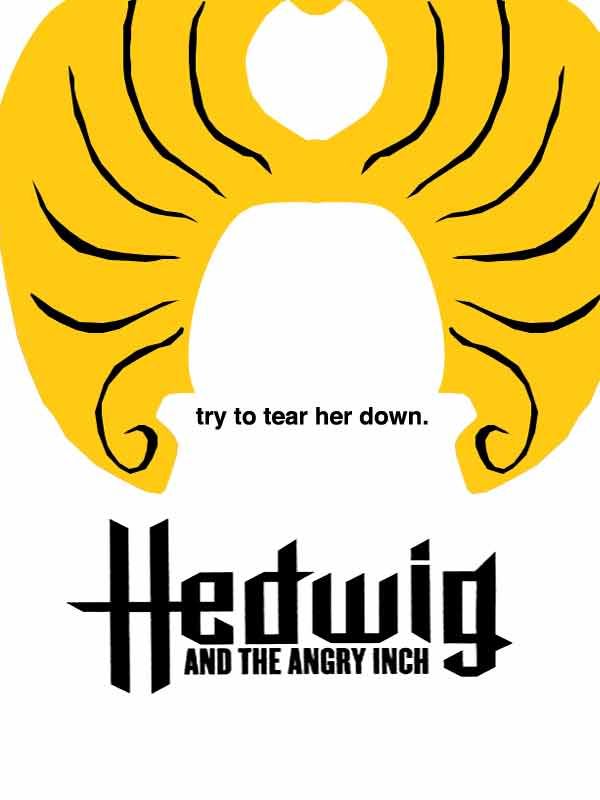
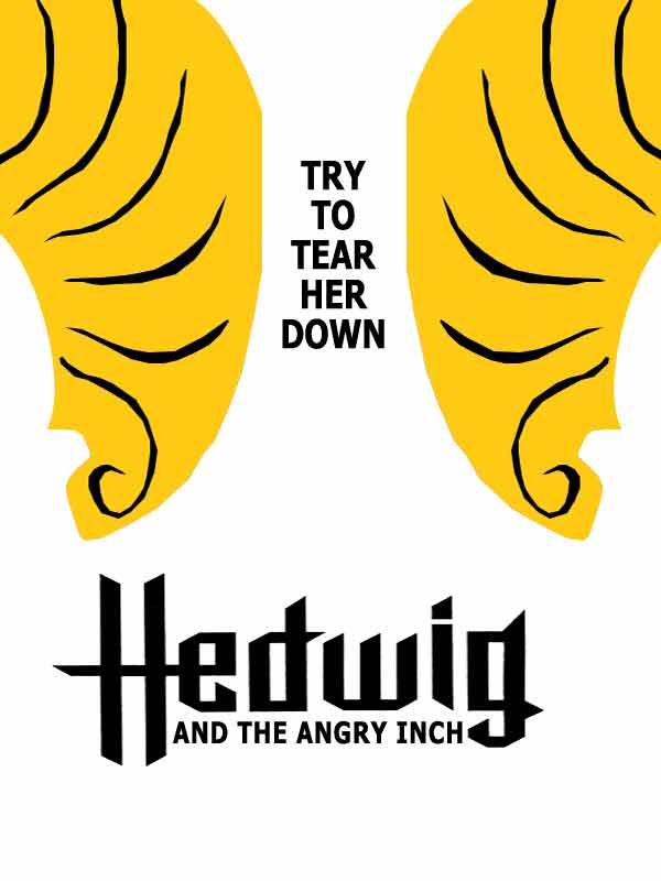
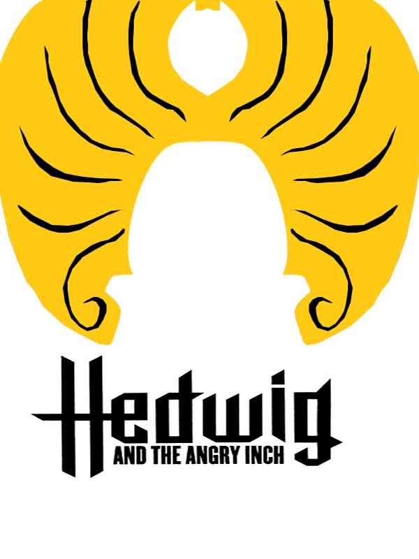
HEDWIG POSTER

in having to desgin a new movie poster,
one major fact was causing me great hesitation:

the original hedwig movie poster photograph was taken by the legendary mick rock.

how can i dare compete ?!


by doing the exact opposite:
where rock's poster is pure GLAM,
mine will be simple, clean
and purely symbolic
(if not slightly escoteric).

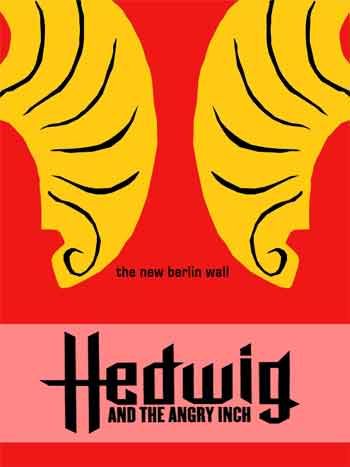
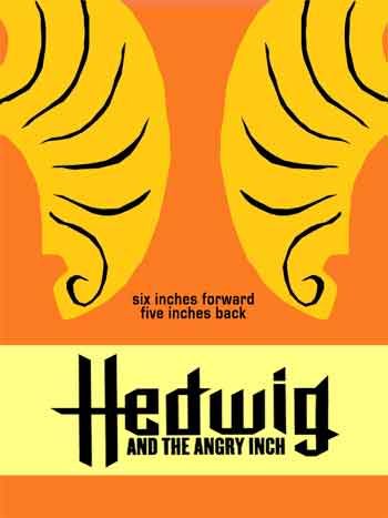
here are 3 versions so far.
i use the wig as a symbol to represent hedwig.


in 2 of the three versions i use the phrase "try to tear her down", but left it out in the third version for aesthetic purposes.

i'm struggling with the typography.


Monday, April 03, 2006

hedwig opening sequence styleframes

Thursday, March 09, 2006

a sort-of final.

Tuesday, February 21, 2006

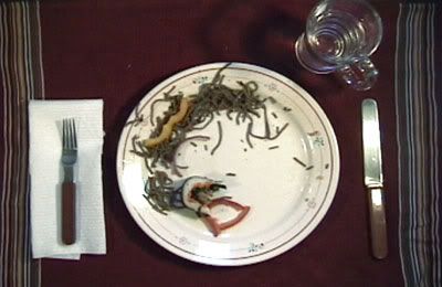
this isn't quite it.


what this week has made me realize:
* new placemat is needed

* zoom in closer--place setting can "frame" the plate but it doesnt need to be in the frame as a whole

* use plastic silverware, light reflects off of real silverware and is distracting

* watch out for shadows around food (black eye)

* NO SUSHI EYES--to busy/not as expressive. although its funny.

"type" and words